

i arranged paint(1)'s default color palette by approximate value and function
EDIT: the paint(1) default color palette is the C64 color palette! :O
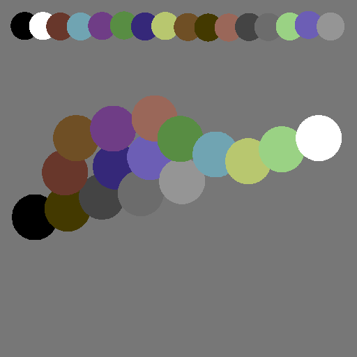

finding out that this was the C64 color palette has me now wondering what are the qualities that give a color palette a retrocomputing vibe, because i haven't significantly interacted with the C64 ecosystem before, but i did find the palette to be charmingly quaint.
my current theory is a small constrained set of arbitrary colors with gamut gaps that require substitutions
from looking at various wikipedia lists the other night, most old systems with constrained color pallets did not put a lot of thought into the selection of the colors (with some notable counter examples) and most went for a mathematically convenient distribution that mostly involves the unbroken primaries, their secondaries, etc
so i think the specific hues don't matter quite so much (though pico8 somehow manages to completely nail the vibe while looking totally ahistorical) as being constrained to a very low number of colors.
i also suspect that larger adaptive palettes can be fine provided one sticks to construction rules that feel more or less accurate to weird 8 and 16 bit graphics hardware
so for the project i'm considering all this for, i'm thinking i'm going to produce a common palette of hopefully no more than 64 colors, and design the sprites such that they could be plausibly implemented as a low fixed number of layers with no more than 4 colors per layer. i'm drawing some inspiration from the super gameboy here, but i'm not going to have a fixed tile size. I'll work out the exact rules for layering later
i might also pick the common palette from an existing catalog such as the x11 colors or common art paint colors as a starting point and nudge as needed. i think not having total control over the color (or at least looking like you don't) will also help



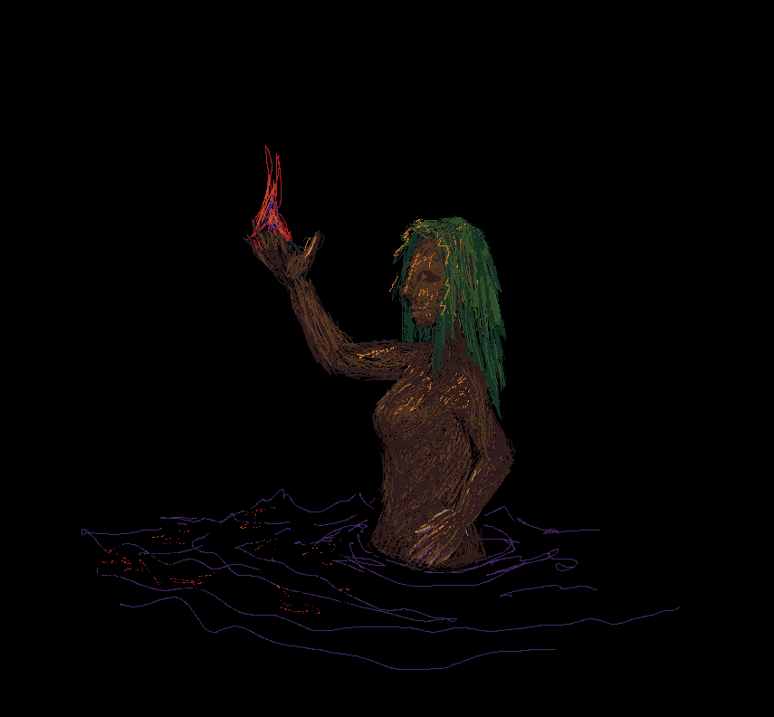
flaming hands is a lot easier to cast when your hands are made out of wood
(test painting using the new palette)

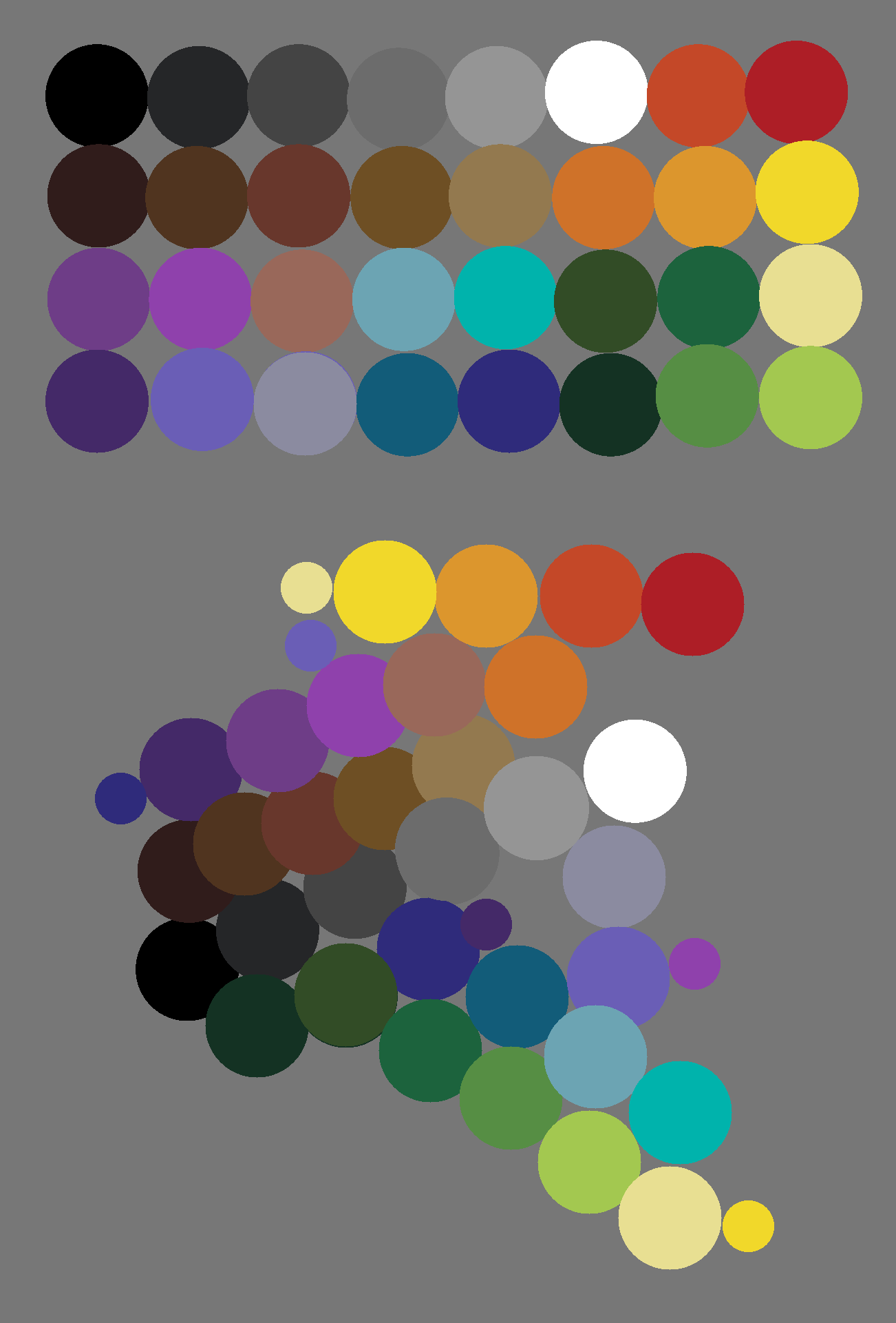
@eniko i started with the C64 palette, and some of the original colors are still in there

@p noice. i hacked mine up to read an override palette from stdin, expand the palette to 32 slots, and use a circular cursor.

@aeva it seems like the colors all have pretty low saturation - like the entire palette is being seen in twilight. Is that the intention?
@nicklockwood yup. I'm going to be using it to draw the art for a dungeon crawl game
@p i wonder if they'd be likely to take any of these improvements (your palette stuff and my cursor changes) upstream


I think it's more technical than price. Remember these are 8 bit machines, so it's easier to express colors in ways that fit inside a single byte, otherwise you have to do three instructions per pixel, which slows your calculations down significantly.
That limitation gives you 2 bits per color (or 2/3/3 if you want to get fancy), which means you do not have that many options for color gradients.
@aeva
- replies
- 1
- announces
- 0
- likes
- 0
@wouter @aeva I think we are not asking why so few colors, but rather why the colors are so evenly spaced, which both creates unattractive color combinations and results in perceptual "bunching" because humans don't see all colors equally well.
In this era the palettes are set by hardware designs rather than CPU math, so it's not to save cycles specifically.
@mcc I saw someone speculating that the color spaces of old graphics chipsets were probably in some part determined by what components were cheapest at the time. I think picking at least the additive primaries and secondaries makes sense as they're the colors that will generally look the most striking. I also get the feeling that system palettes have some amount of "we don't know what you will want, so we'll try to provide as much variety as we can"
I made some new tiles using the new color palette. I'm pretty happy with how they turned out! #screenshotsaturday
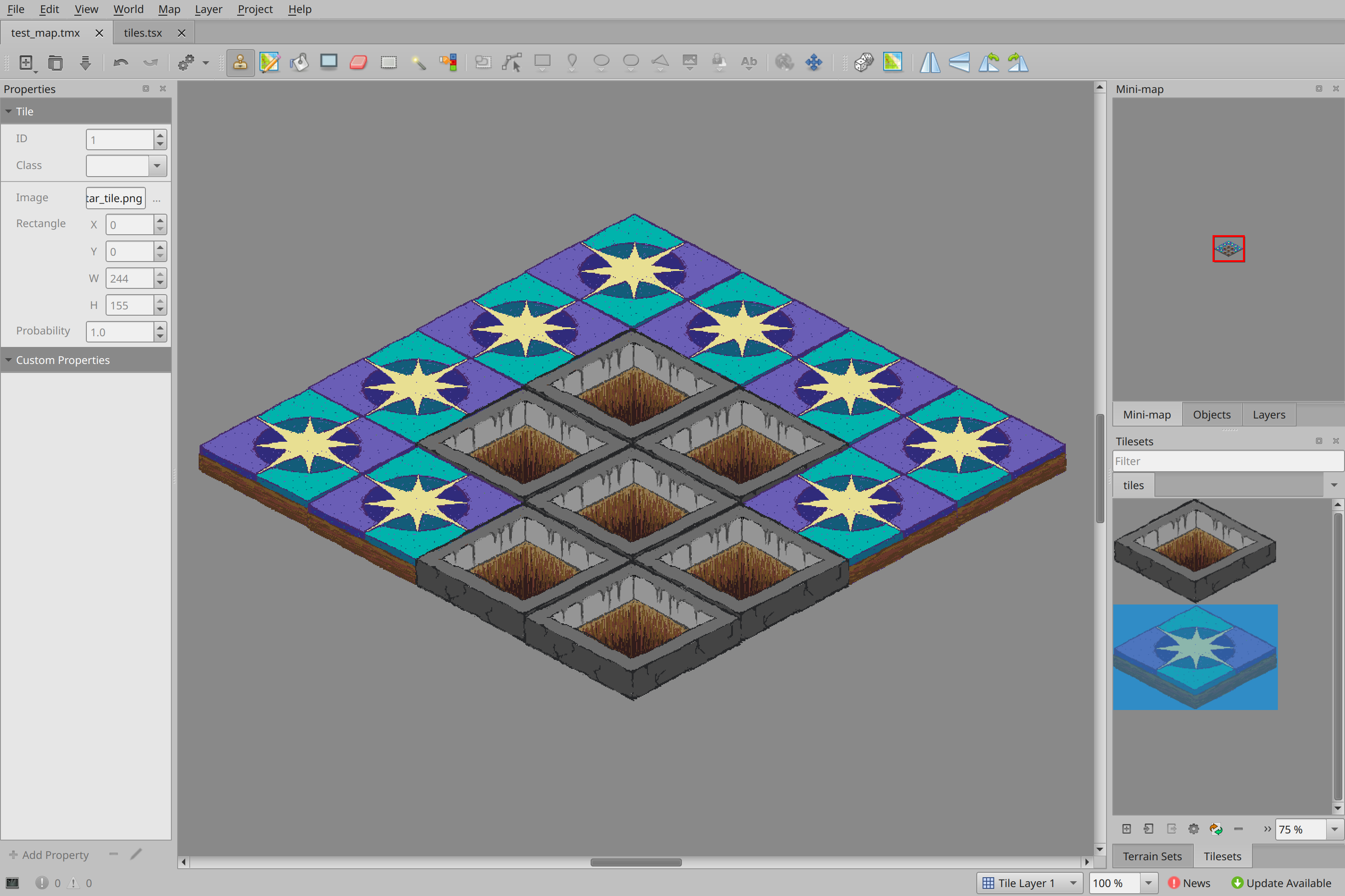
anyone know if there's a way to set an arbitrary pixel offset for a given tile within a tileset in #tiled?

@aeva a certain value or randomized? Don’t the later is possible yet.
https://discourse.mapeditor.org/t/how-to-offset-tiles-individually/7240
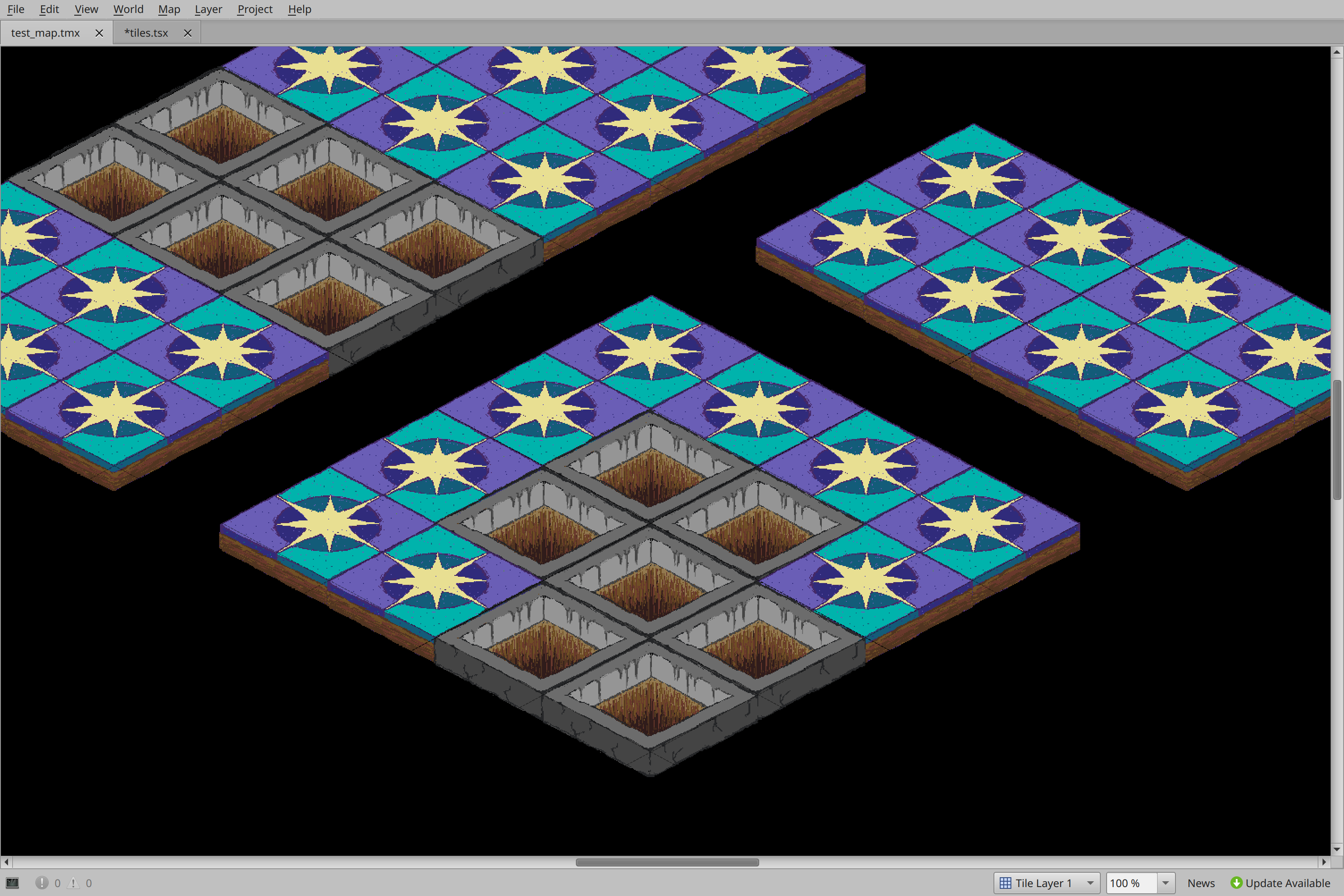
ah, the problem was i punched in the grid wrong. per-image offsets would still be nice, but this is fine for now. i love that this style is pretty resilient to things not lining up quite right :D

@NullTheFool these are the html color codes for the palette and a krita palette file for it
https://zone.dog/fnord/palette.txt
https://zone.dog/fnord/palette.kpl

@aeva @NullTheFool the html color code reminded me of [1]. It's a CSS that define variable for the xkcd colors [2]. So if you add [1] to your page, you can write css like `background: var(--xkcd-sea-green);` instead of `background: #53fca1;`.
[1] https://git.hatspace.net/nycki/nycki.net/raw/branch/main/static/xkcd.css
[2] https://xkcd.com/color/rgb/
@gkrnours @NullTheFool this is why webpages take forever to load these days
@aeva @NullTheFool :O
I mean, it's true, especially when a slop bot is hammering the poor website. But 👉👈