When reading code snippets in academic papers, do you like any of: monospaced font? symbol substitution (e.g. -> becomes →; \a becomes λa); syntax highlighting via colour?
@goldmann Thanks for your feedback! funny you should mention LaTeX, that is relevant to why I asked :-)
@laxla so you like the symbols in say, your editor (wiht ligature-font) but not in a PDF, is that right? Thanks for your response!
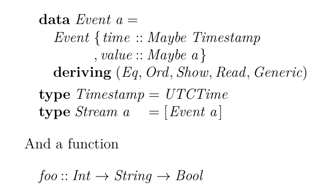
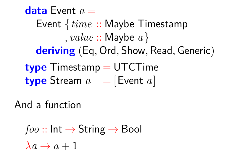
Two examples. Exhibit A: formatted using Listings package; Exhibit B: formatted using "lhs2tex", without any option tweaks
I think I'd prefer B if it hadn't gone so heavy with italics. I might be able to turn that off.
I think I'd prefer B if it hadn't gone so heavy with italics. I might be able to turn that off.


@laxla ah I see. Yeah, in the LaTeX packages I am looking at, they put a lot of effort into vertical alignment issues
@laxla Code. This is a computing PhD thesis. Edit: but the preprocessor lhs2tex is using math-environments for the typesetted code, so there's some overlap here
- replies
- 1
- announces
- 0
- likes
- 0
this is copying the syntax highlighting decisions that my code editor is using, but now I'm wondering, more fundamentally, what do I want to emphasise or de-emphasise? what is important? aargh
@laxla Latex is a pretty natural choice for writing a PhD thesis. What would you suggest instead?
@rivets for alignment? or legibility? I've seen convincing arguments both for and against legibility of proportional versus monospaced text. Personally I'm not sure.
@laxla Thanks for your input. Most Markdown→PDF workflows round-trip via LaTeX (I'm pretty sure Pandoc does). And I'm not sure they do anything special wrt formatting code -- likely just monospace it. Alas it's too late in my write-up to rework the whole thing in Markdown (or anything else) now. FWIW I've been mostly happy with LaTeX.
@laxla thanks: I hadn't seen or tried "minted" from those answers, so I'll give it a look!

